Looking at the slick impact of today’s desktop Twitter profile page, there’s little hint of the fact that the site grew out of a simple mobile text messaging app. But grow it certainly did, and with Twitter now staggeringly influential in world media, it’s fascinating to trace things right back to the humble beginnings and chart the site’s aesthetic evolution. So, in one epic post, here’s the history of Twitter, visually represented in the changing face of its profile page, from the inception year of 2006, to the time of writing. Most captures have been edited to reduce the height of the timeline, but all efforts have been made to retain the essence of the layout…
2006
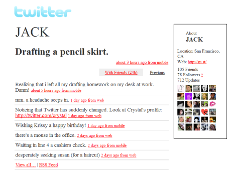
Heading the post is the profile page of co-founder Jack Dorsey in its early November 2006 incarnation. Apart from the primitive look of the page, there are several points of note. Tweets were referred to as Updates, there was no total for Favorites displayed, and most interestingly, the Following total was referred to as Friends. Even today, many Twitter users and third party apps substitute the word Friends for Following, but in order to see the “Friends” terminology in official use on the profile page, you have to go right back the site’s birth year of 2006.
The first surviving user-reference to Favorites on Twitter dates to 18th November 2006, which was shortly after Favorites totals started to show on users’ profile pages. I’m therefore guessing that Favorites weren’t introduced until around that point in the autumn. The word “Tweet” was use in 2006, but “Updates” continued as the language used on the profile page until the middle of summer 2009. As an aside, in 2006 there was no Block function on Twitter. That wasn’t introduced until spring 2007 – after a considerable number of requests from users.
2006 to 2007
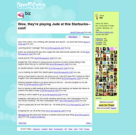
The next page design is shown above. This is the profile of Twitter co-founder Biz Stone, as it looked in summer 2007, but the redesign was first implemented in early November ‘06. In fact, if you read Jack Dorsey’s tweets in the previous example, you can see he was referring to the redesign in the phrase: “Noticing that Twitter has suddenly changed”. The above vision was the default state for the page, but the colours and background could be customised.
By October 2007, there had been another update to the profile page, as reflected in Twitter employee Crystal Taylor’s account above. The layout was more orderly, and some text links had been replaced with buttons. Crystal regularly changed her colour scheme, and she’d made a particularly in-ya-face choice here, but the default colours remained the same as those shown in the previous example.
MORE OF THE SAME IN 2008
The above example is from July 2008, and it reveals that very little evolution has taken place. There’s a language selector at the top of the page, the “With Others / Previous” tabs have gone from the top of the timeline, and the site is now displaying a much more prominent promo for new signups when the visitor is not logged in. But other than that, it’s pretty much business as usual. Molly Holzschlag’s account was one of three featured in a persistent example picture on the main Twitter.com homepage in mid 2008.
SIMPLIFICATION – LATE 2008
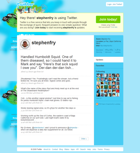
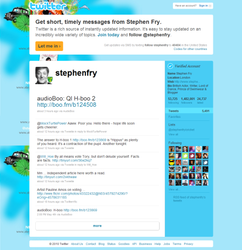
In autumn 2008, the profile page received an update which simplified the layout slightly, and arranged the user stats horizontally rather then vertically. Above, you can see this updated page in March 2009, on Stephen Fry’s Twitter profile. Again, the colour scheme is customised here, but the default was still the same as it had been in late 2006. Stephen Fry joined Twitter in July 2008, and did an enormous amount for the popularity of the site. Not only did he innately understand the in-the-moment info/trivia soundbyte format; he also promoted Twitter on television, and built a notion that it was possible for anyone to connect and share their thoughts directly with celebrities. That hotline to celebrities and influencers is still one of the primary attractions of Twitter.
2009 UPDATES
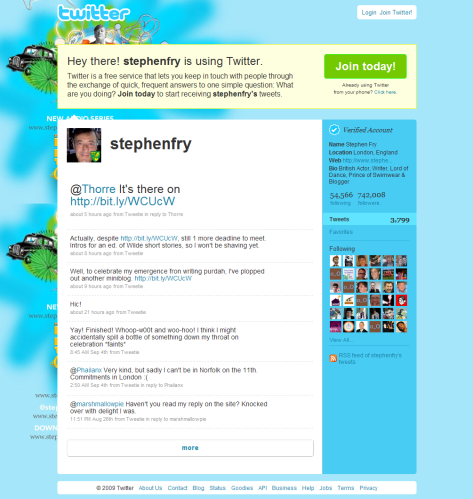
In summer 2009, the profile page began to reference posts as Tweets, rather than Updates, and the horizontal line of user stats was to an extent broken up. With this revision came the first change to the default colour scheme since 2006. Again, Stephen Fry’s page demonstrates the changes.
In autumn 2009, Twitter introduced a grouping feature called Lists, and the Lists users created (the public ones, at least) began to appear on their profile page. Above, you can see the Lists feature added to Stephen Fry’s page.
ONE YEAR ON
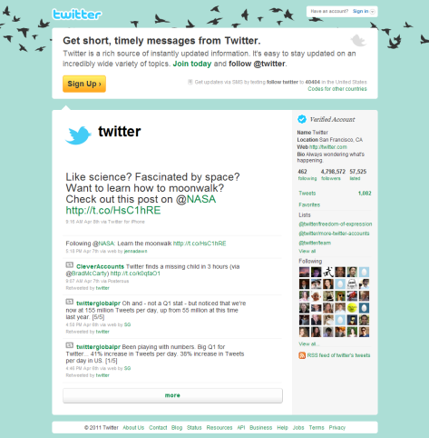
Here’s the profile page for Twitter’s offical account in spring 2011, showing that barely anything has changed in design terms. In latter 2010 Twitter’s default profile pic changed from the bird to the now familiar egg, and that’s reflected in the mini-avatars of the followed users in the sidebar. Compare the Following block with Stephen Fry’s in the previous capture and you’ll see the evidence. A lot of major functional updates and enhancements hit the site in late 2010, but aesthetic progress on the profile page had been minimal. That was about to change…
LOGGED IN TO A NEW ACCOUNT – MID 2011
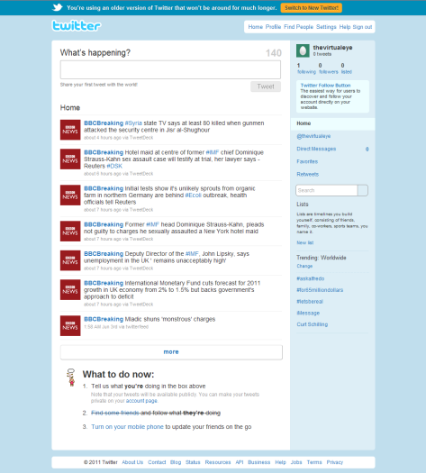
The above capture shows how things looked from the inside of a brand new UK Twitter account in early June 2011. The old, 2009/2010-style layout was still the default, but a prompt at the top of the screen gave access to a new, 2011 Twitter interface. In fact, the layout of Twitter in the first half of 2011 was not significantly different from the 2007 version, and apart from looking a lot less primitive, it could even be said to broadly follow the appearance of the Twitter of 2006.
What you notice, looking back, is how much less aggressive Twitter was with new users. The screen was not plastered with follow suggestions and the timeline was not populated with unsolicited tweets the site thought “you might enjoy”. The user was left to learn about Twitter at a much gentler pace, without the tragic ‘instant timeline’ idea and the heavy-handed pushiness. A much nicer and more peaceful environment, which seems almost like a different site today.
2011: FIRST MAJOR AESTHETIC REVISION SINCE 2007
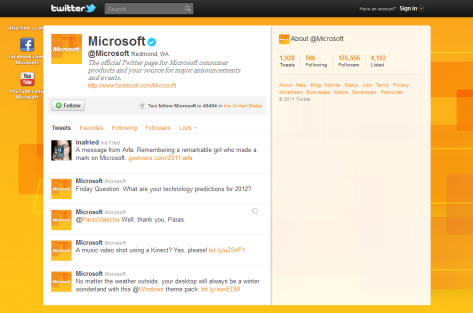
The 2011 update is seen above on Microsoft’s profile page. The sidebar is much wider, the bio is now much more prominently displayed, some of the functions have been shifted to more intuitive positions, and there’s now an unmissable Follow button right at the epicentre of a visitor’s attention. I really enjoyed using this layout.
ABOUT FACE – SIDEBAR AND TIMELINE SWITCH PLACES
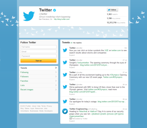
Around February 2012, Twitter completed a switch in the positions of its timeline and sidebar, so that the sidebar appeared on the left, as opposed to its original home on the right. The user stats and bio were completely separated from the timeline and sidebar areas, and sat on their own panel at the top of the page.
This was an unpopular change, and developers for the Firefox add-on Stylish were quick to produce hacks which allowed users to restore the sidebar to the right. At or around the same time, follow suggestions, which had previously been optional, were ‘hardwired’ into the Twitter interface for the logged-in view, so desktop users would see them whether they liked it or not. Once again, Stylish responded with a hack to remove the otherwise forcibly-displayed suggestions.
Notably, the Twitter PR machine was exceptionally quiet about this set of revisions, and the usual round of “Twitter Update!” tech blog articles was conspicuous by its absence. Twitter clearly knew users were not going to like this, but for commercial reasons they probably had little choice but to do it.
THE 2013 PAGE – SMALL HEADER PIC
The next big update was rolled out from September 2012, and saw the profile page gaining a header picture for the first time. As usual, the rollout took a while, and there were still some non-header pages remaining in December.
The profile page of 2013 was not the best looking by any means (not on desktop PC’s, anyway), and when users neglected to upload a header (which many did), the general aesthetic quality was pretty grim. The bio text didn’t always overlay well onto the header pic either, and could sometimes look unclear.
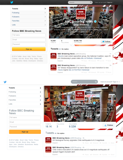
But operationally, this page was a great experience. Above you can see two variants of the ‘small header’ page, on the BBC’s Breaking News account. The top version shows the page as it was throughout 2013, with a black ‘navbar’, fairly narrow timeline, and a small, dark font for the user stats.
The lower version was really a transitional page, showing evidence of the progression to an altogether new beast. Rolling out from around the dawn of 2014, the transitional page had a white ‘navbar’, a wider timeline and header/bio section, and a much larger, lighter font for the user stats. When my own page received this ‘update’ on 3rd February 2014, I commented in my diary: “It looks like it’s not finished”. How right I was…
SPRING 2014 – NEW DAWN OR FINAL NAIL?
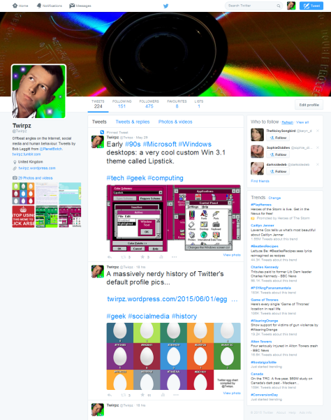
On 12th February 2014, word began to circulate of a new, completely alien, far more modern and infinitely more visually-striking profile page design for Twitter. At the time still only on test (but clearly a case of “we are definitely doing this”), the new page was part of a positively humungous site redesign. Early opinion was very much love or hate, and that remained the case through the introduction phase.
Users were first given the option to switch to the new page of their own accord, and were able to switch back if they didn’t like it. But eventually (on 29th May 2014), all stubborn dissenters who’d stuck with the old design were switched to the new one by force.
What pretty much everyone agreed upon was that the idea for the design was heavily influenced by Facebook. But beyond that, acceptance depended on the type of user.
For readers – particularly those who liked to view conversations, the new page was and still is a disaster. In a functional sense it’s never come close to rivalling the 2013 profile page, which would load convo’s below a tweet rather than taking the reader to a new page every time they wanted to see the reactions.
With a site built on scrolling and with no other means of navigation, this was unforgiveable. You scroll down miles and miles to find something on a profile page, then you click it, then you get whisked off the page and have to go back, only to have lost your place in the scroll and have to scroll all the way down again, from the top. Extra page loads for Twitter and thus better usage stats to show the advertisers, but huge inconvenience and annoyance for the people who really matter – the readers.
Those who just want to shout and be the big “I am”, however, would probably love the new design, because they could make a better visual representation of themselves than they could before, and it was easier for them to hide things they didn’t really want profile visitors to see. For example, since replies were taken off the profile page for all users by default (something only available to Verified users previously), spamming tactics would not, at first glance, show up.
Following in a meaningful fashion became harder with the redesign too. It now takes much longer to get the information you need when looking through a user’s follow list (mainly, once again, because clicks divert to a new page). The redesign would inevitably drive a lot more users towards third party apps.
And the resource drain on the desktop version massively increased. The Twitter profile page of 2013 was very light on RAM, but the 2014 update killed that off, putting a load of older desktop machines in need of a RAM upgrade.
But by spring 2014, Twitter was a long way from its roots. It had long outgrown simple, group text messaging and had, by and large, turned into just another secondhand content site. A secondhand content site that put ordinarly people in contact with celebrities and gave ‘marketers’ a free reign to spam to their hearts’ content maybe, but a secondhand content site all the same.


You must be logged in to post a comment.